UX Design Project
During my junior year at the Columbus College of Art and Design, I had the opportunity to take a UX Design class. I was already deeply interested in the subject and had been exploring it independently before enrolling in the course.
In the course, each group was assigned a specific problem to address. We gathered data, created user personas, and developed an app to provide a potential solution.
Our problem was how to get more people in Columbus Ohio to recycle.
The Problem
Citizens in the area are not properly sorting or utilizing the available recycling options. The city hopes to build a dedicated app for recycling with info, instructions, motivations, and easy access to locations.
When it comes to the United States, 94% of Americans support recycling and 74% say it should be a top priority, but only about 35% of people actually recycle. The top reasons Americans say they don’t recycle regularly is a lack of convenient access and knowledge.
— Data from a joint survey by the World Economic Forum, SAP and Qualtrics
Our Findings
After interviewing a couple people who lived very different lifestyles, we realized there were common problems and set backs for majority of people not recycling:
A need for a basic resource of knowledge.
A need of an index of local resources.
Some sort of motivation tool.
Our Solution
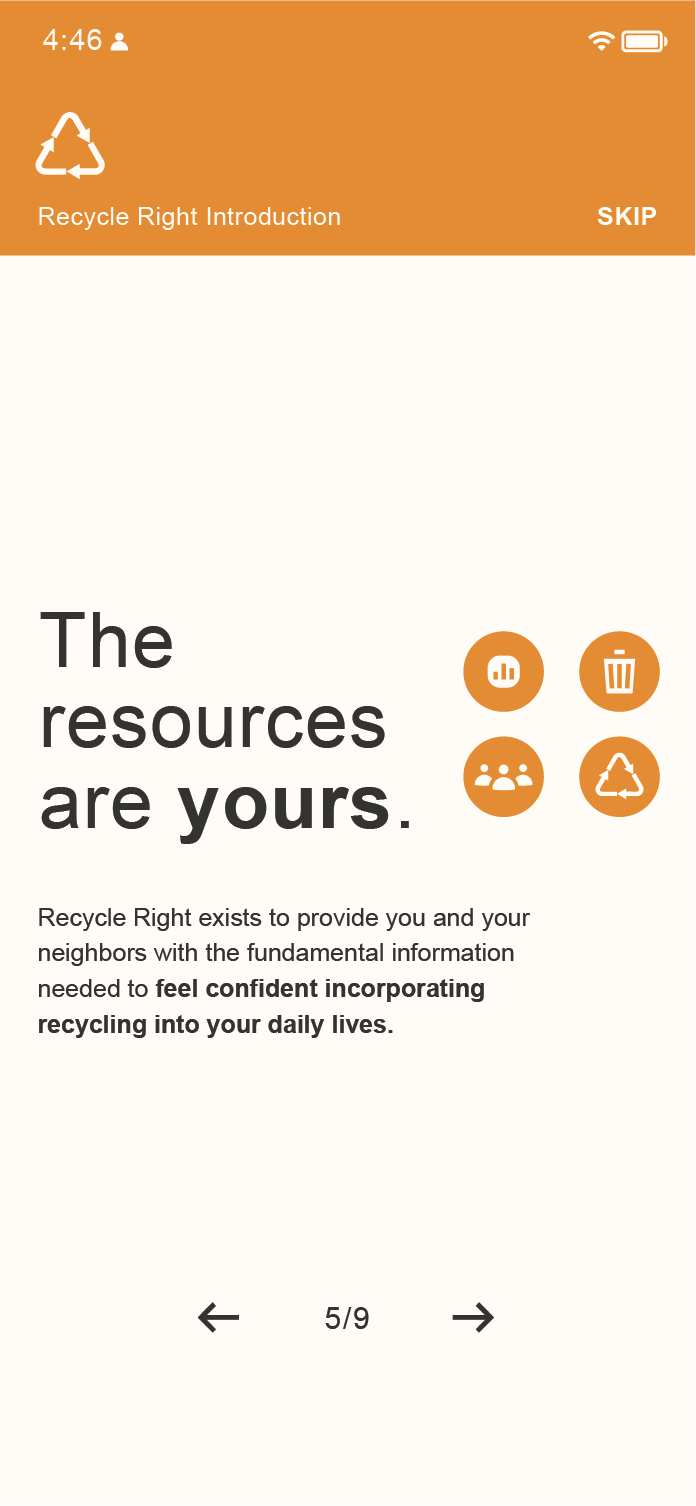
We aimed to create a community resource to assist in these problem areas and get people wanting to recycle correctly and easily.
Introduction to recycling
Learning about recycling & identifying local resources
Setting-up
Adapting to their lifestyle
Do I keep this up?
Maintaining consistent use
Recycle Right - Storyboard
The Design: Moodboard & UI Kit
For the design approach of how we envisioned our recycling app, I pitched an angular, color-coordinated shape scheme inspired by the bold and efficient designs often seen in subway station signage. These systems are known for their ability to convey information quickly and clearly, even in high-traffic environments, which aligns with our goal of creating a user-friendly app.
We chose this design route for a couple of key reasons. First, the vibrant, angular shapes allowed us to make the interface visually engaging and attention-grabbing, which we believed would resonate well with users and encourage them to interact with the app. At the same time, the consistent color coordination provided a sense of structure and order, helping users navigate the app intuitively and locate features or information more efficiently. This balance between being visually flashy and practically uniform was critical in designing an app that stands out while still prioritizing user experience.


